Create the Perfect Photography Logo
Thinking of designing a logo for your photography business?
Your logo is the first thing people notice, making a lasting impression. Choosing the right colors, fonts, and symbols can make all the difference. But don’t worry. You don’t need to be a designer to create a stunning logo. Let’s break it down step by step!
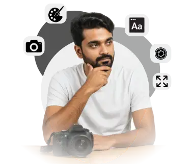
Why Your Photography Logo Matters
Your logo defines your brand and shapes how people see your photography business. A well-designed logo helps you:
Make a strong first impression and attract potential clients.
Establish a professional identity that builds trust.
Showcase your unique creativity and photography style.
Differentiate yourself from competitors in a crowded market.
What Makes a Good Logo
A strong logo isn’t just about looking good—it needs to function well across different platforms. A good photography logo should be:
Simple – Avoid unnecessary elements; keep it clean and recognizable.
Memorable – It should stick in people’s minds.
Timeless – Avoid trends that might look outdated in a few years.
Versatile – Should look great on websites, social media, and prints.
Relevant – Reflects your niche (e.g., weddings, portraits, or landscapes).
Important Elements of a Photography Logo
Before creating your logo, ask yourself:
What type of photos do you take? (Weddings, portraits, events?)
What style do you want? (Elegant, modern, fun?)
What makes you unique? (Your editing, creativity, or theme?)
✅ DO: Make sure your logo matches your style.
❌ DON’T: Don’t copy others or follow short-lived trends.
Choose a Logo Type
There are three main types of photography logos
Word Logo – Your business name written in a nice font.
Lettermark Logo – A stylized version of your initials.
Combination Logo – A combination of an icon and text.
Tips for Typography in Photography Logos
Fonts are an essential aspect of logo design. The typography should complement the overall look and feel of your brand. Consider these tips:
Serif Fonts – Great for classic and traditional vibes.
Sans Serif Fonts – Clean and modern for a minimalist design.
Script Fonts – Elegant and artistic, but should be legible.
Add a Unique Symbol
Design an iconic, simple logo for your photography business with these helpful tips.
- Avoid generic camera lens or shutter icons.
- Avoid using elements like trees, mountains, etc.
- Avoid using overused film strip frames.
✅ Do keep it simple! : A simple design is often more memorable and effective.
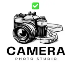
❌ Don’t use generic icons or shapes : Avoid stock images or anything overly common.

Choose the Right Colors
Colors set the tone and feel of your brand.
1

Classic
Timeless and sophisticated colors like black and white.
2

Luxury
Gold and silver create a premium feel.
3

Creative
Bright and vibrant colors for a fresh and modern look.
Social Media
Profile Picture Ideal dimensions: 180x180px for best results.
Cover Image Ideal dimensions: 820x312px for Facebook..
Post dimensions: 1080x1080px.

Facebook Cover
Dimensions: 820x312px.
YouTube Banner
Dimensions: 2560x1440px.
Website Branding

Header Logo
Dimensions: 1920x500px.
Favicon
Dimensions: 32x32px.

Watermark
Position your logo subtly over images.
Create Logo Versions
Full Logo
The complete logo, including your symbol and text.

Icon Only
Logo without text, great for small spaces.
Black & White
Simplified version of your logo in black and white.

Save in the Right Format
- JPG – Ideal for web use, not scalable.
- SVG – Scalable vector format, great for print.
- PDF – Best for print and exporting high-quality logos.
- PNG – Transparent background format for digital use.
Mistakes to Avoid
- ❌ Avoid logos with too many details or unnecessary elements.
- ❌ Avoid using inappropriate colors that don’t fit your brand.
- ❌ Don’t forget to test your logo in various sizes and on different backgrounds.